Overview
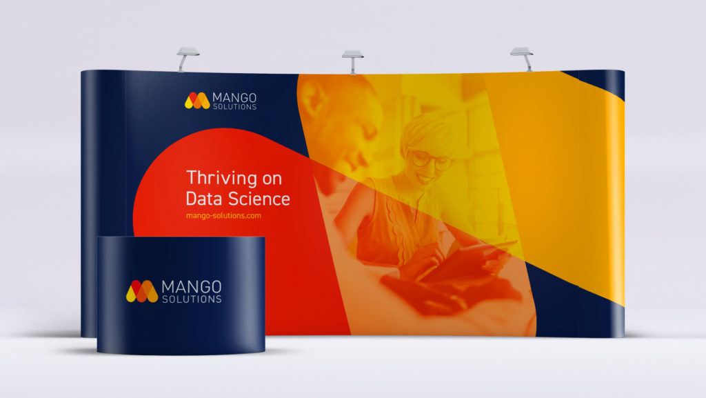
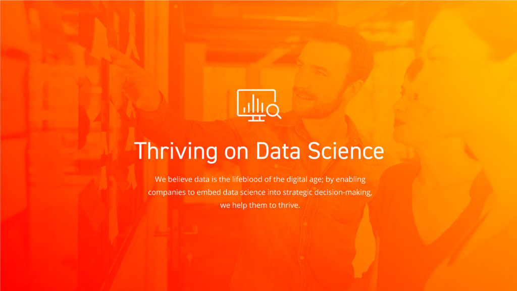
Mango, a leading UK data science consultancy with its roots in the ‘R’ community (‘R’ is a language and environment for statistical computing and graphics that is strongly associated with data science) was breaking into new territory: they were increasingly targeting enterprise audiences. Mango came to us seeking out a new value proposition and brand new website that would engage with the notoriously diverse enterprise audiences. We proposed a unique value proposition based around the notion of ‘Thriving on Data Science’ as well as an enhancement of the established brand and an overhaul of the website to provide a look and feel that fits a modern technology company.
Objective
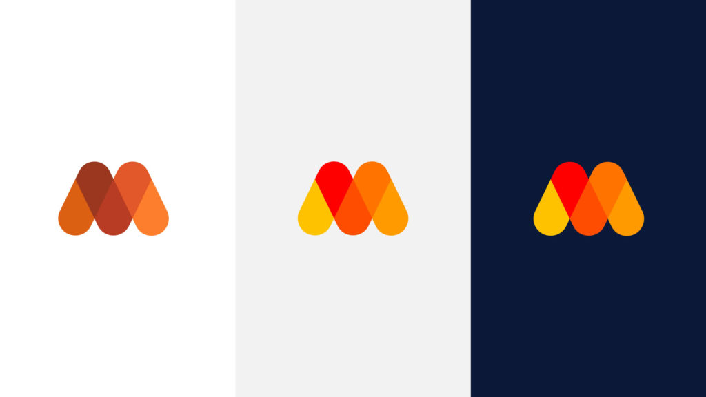
Mango needed a fresh, new value proposition that was able to engage these wide audiences. In addition to this, the existing brand and website was dated, with excessive use of flat, muddy colors such as browns and burnt oranges. The ask was straightforward but the project itself was huge, and Mango needed it fast – with the whole site looking to be turned around in just three months.
Execution
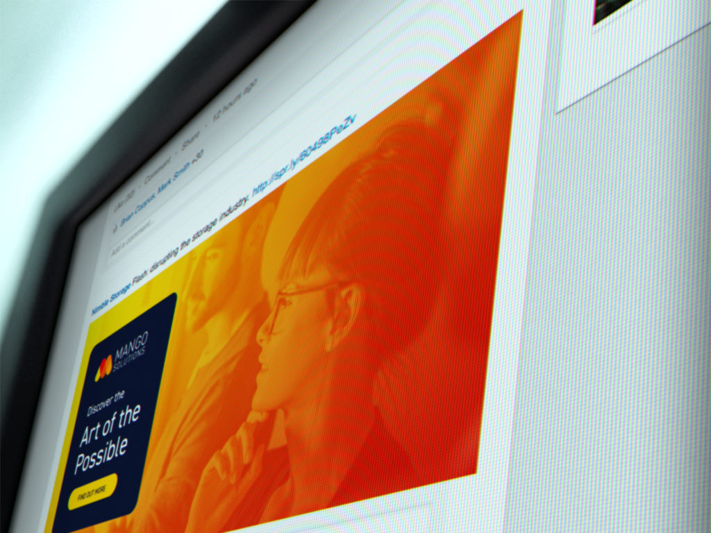
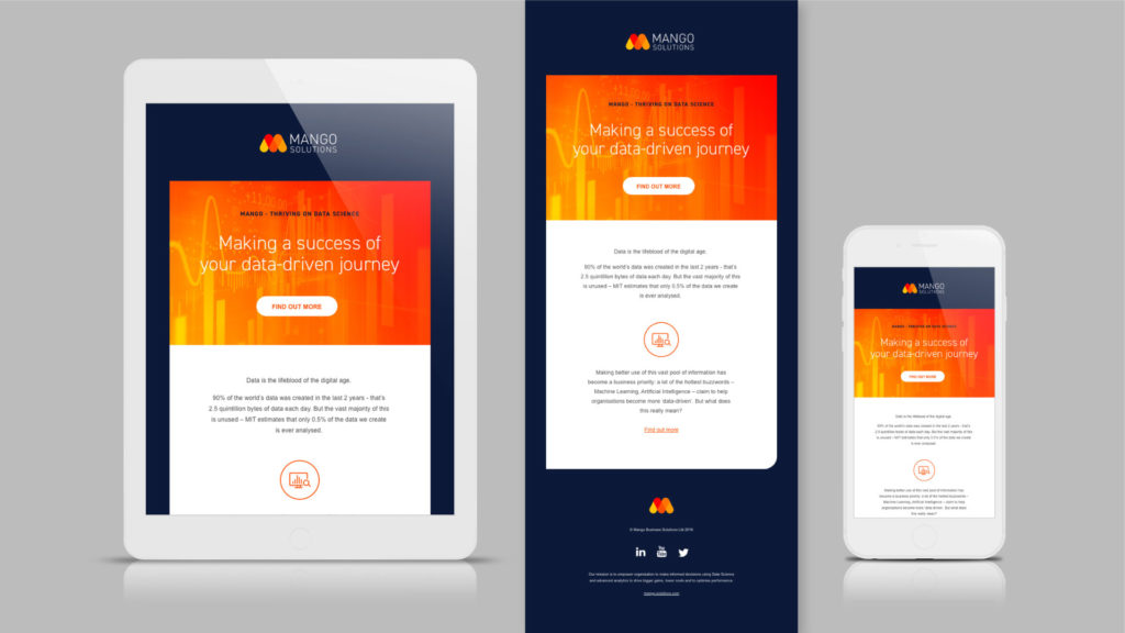
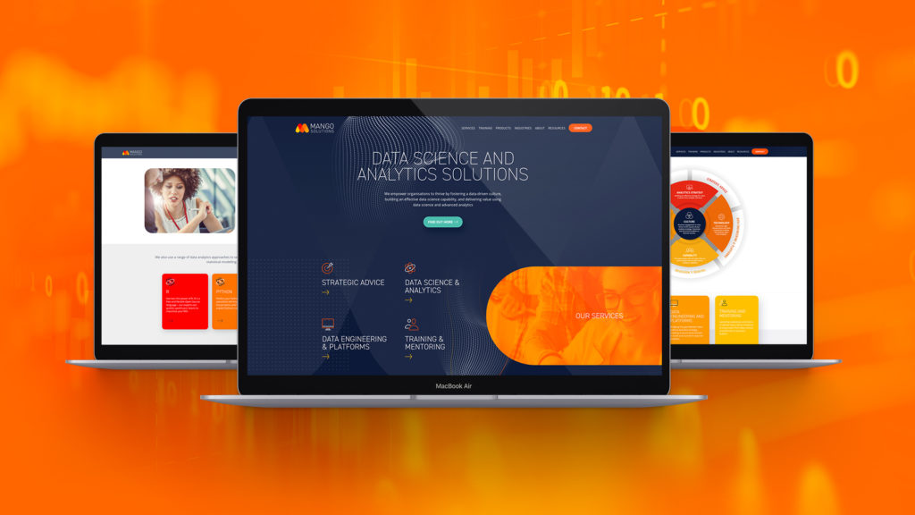
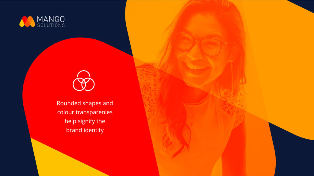
We began by interviewing all the key stakeholders and, with their insight, developed a value proposition based around the notion of ‘Thriving on Data Science’ which spoke to both academic and enterprise audiences and also worked equally well with employees. This positioned Mango as a consultancy that helped companies translate data assets into operational acumen through embedding data science into strategic decision-making. This positioning was then used to generate the copy for a new web site. Meanwhile, the studio team set to work on the brand, enhancing the colors in the logo to make them more vibrant, vivid and more reflective of the data science industry. The bright colors were striking against a dark blue background, making the logo look modern and fresh and much better suited to a technology company. We also created iconography for each product and service, bringing a distinct identity to each. The brand elements mirrored the round shapes and edges in the logo design and used color transparencies to help create depth. The photo style is less traditionally corporate, the data images are dynamic and modern and the iconography is simple and contemporary.

Results
The project was done to particularly tight three-month schedule, but it was delivered on-time and the end product surpassed expectations. The website is responsive, sleek and breathes confidence and professionalism – a perfect fit for a modern company who are experts in scientific data and analysis. Both the value proposition and website were met with praise across Mango.
We are immensely proud of the new website which is a significant step forward in terms of the styling, brand presence and content. We are hugely grateful to Enigma for the hard work that has gone into producing the website and for its guidance and expertise which has delivered such an excellent result. In particular, we are hugely appreciative that the whole project was driven to some tight deadlines
Amanda Cleverly, Marketing Manager at Mango Solutions